You probably know that the majority of web traffic originates from mobile devices rather than personal computers, leading to new best practices in website development and design. In addition, Google enforces mobile standards with its mobile-friendly test. Failing that test can have an effect on search results. If you want the sites you build to compete effectively, they must be fully responsive.
“Responsive” means a website has to look good and function smoothly and pass usability standards on smaller screens and in mobile browsers. Sites that are designed and tested only on desktop computers rarely provide a good user experience on devices where screen real estate is limited.
In this post, we’ll discuss some best practices in responsive design and then show you how to streamline the process with HostFiti Website Builder. Please note that this steps are not required as a website built using our website builder is responsive by default. Besides the built-in responsive capabilities of the Website Builder, the builder’s responsive editing mode lets you tweak your layouts while viewing your pages on large, medium, and small devices.
Let’s get to work!
The Key Elements of Responsive Design
There’s no one-size-fits-all approach to ensure that a website looks and functions well on small screens, but here are some key elements you should pay attention to when building a responsive website:
- Device size. It’s not feasible to have a different version of your site for every screen size and resolution imaginable, so design tends to be based on categories of screen width: large (desktop), medium (tablet), and small (phone).
- Layout. HostFiti Website Builder automatically moves rows of columns on the large screen to vertically stacked columns as screen size decreases. You can change the stacking order and tweak other aspects of the layout to better shift from horizontal to vertical orientation at smaller screen sizes.
- Spacing. It’s important to use plenty of white space at every screen size, but on a mobile device it’s crucial to ensure that users have room to interact with the various parts of your site.
- Visibility. Given how little space you’re working with on mobile devices, sometimes you can enhance the user experience on mobile devices by hiding some of the elements that appear on the large-screen version. Of course you want to retain the most important information, but the full site might have elements such as images that don’t add any value to the small-screen version.
Responsive design would take a lot of coding without tools that automatically adjust layout and spacing. Our website builder’s built-in responsive capabilities meet the Google mobile-friendly test, so all you have to do is tweak settings to enhance the user experience at each screen size.
How to Build a Responsive Website with HostFiti Website Builder in 6 Steps
What are the requirements: To have a website created on our platform. If you don’t have a website with us, you can create one here or use our demo site. To create a demo site, go to demo.hostfiti.com, fill the answer to the simple math and a demo site will be instantly be created for you.
Step 1: Open a Page for Editing and Choose a Layout Template
You can learn how to open a page for editing here. (If you are using the demo site, the page will be automatically opened for you for editing – we also highly recommend that you take the tour). When you start to edit a new page, you can optionally select a pre-built layout template, as shown in the following screenshot:
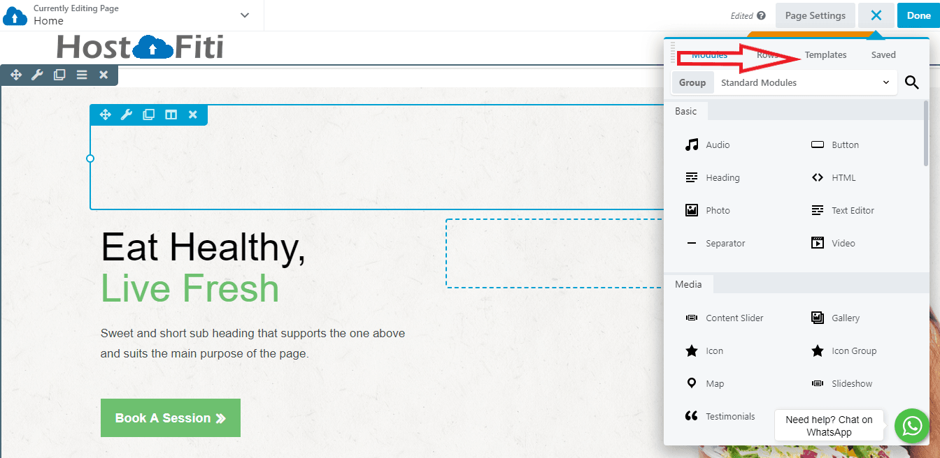
The Website Builder comes with over 100 layout templates to choose from. You’ll find landing pages, industry-specific designs (such as for fashion and agency sites), and specific types of content pages, including a ‘subscribe’ and a ‘coming soon’ page). All of these templates are designed from the ground up to be fully responsive on mobile devices.
If you have your own page design in mind, just start dragging rows and module into the layout area.
Step 2: Design Your Pages Using Responsive Editing
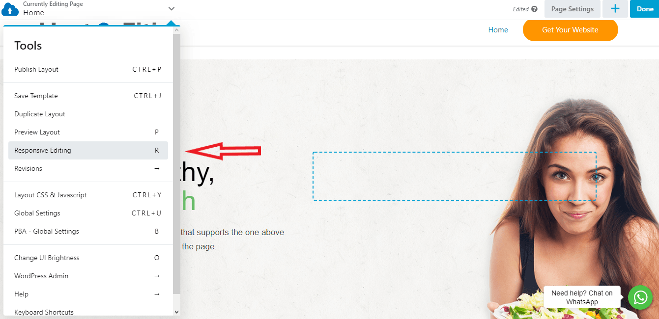
After you’ve modified a layout template or designed the basics of the layout you want, check the page’s responsiveness by going into the website builder’s Responsive Editing mode. To access this on any page, select the Tools menu and choose Responsive Editing or just use the keyboard shortcut “R”:
After you enter Responsive Editing Mode, you can see what your page looks like on smaller screens:
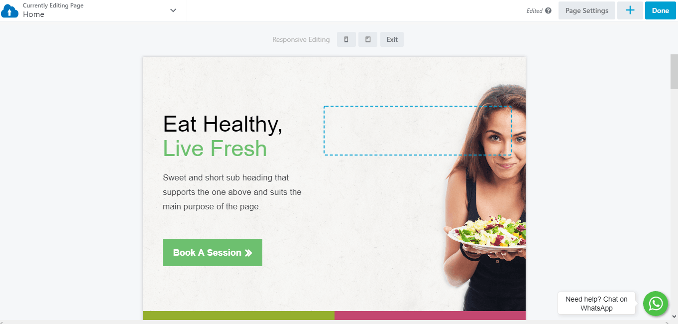
Use the icons at the top of the page to toggle between tablet (medium width) and mobile (small width):
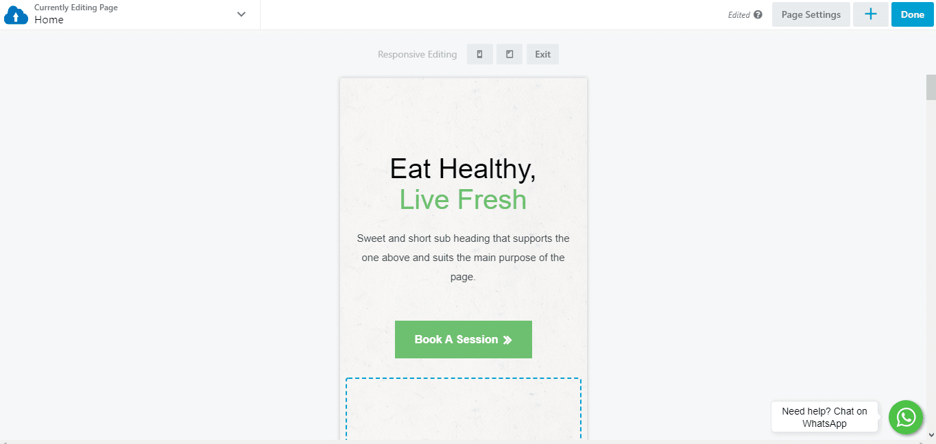
As you’re editing the page, move from one screen width to another to see the result of your layout. This system lets you focus your efforts on the version of your site most visitors are likely to see, but you can also ensure that users have a smooth viewing experience on other devices.
Step 3: Customize Global Responsiveness Settings
If you want more control over how the website builder adjusts settings for responsiveness, open the Tools menu and click Global Settings (shortcut: CTRL + U ) to change options related to site-wide responsiveness:
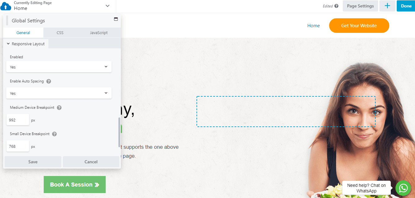
One option is to disable responsive behavior on your site. In most cases, responsiveness should be enabled. It’s also a good idea to leave Auto Spacing enabled. Auto spacing automatically adjusts the margins and padding between elements on smaller screens to avoid content that’s overly crowded or too spaced apart. With auto spacing disabled you’ll probably have to do a lot more manual tweaking.
In addition, you can set custom breakpoints here. If your Medium Device Breakpoint is set to 900px, for example, screens wider than that display the large-screen version of your pages. Screens with a width less than 900px but still greater than the Small Device Breakpoint displays the medium version of your pages.
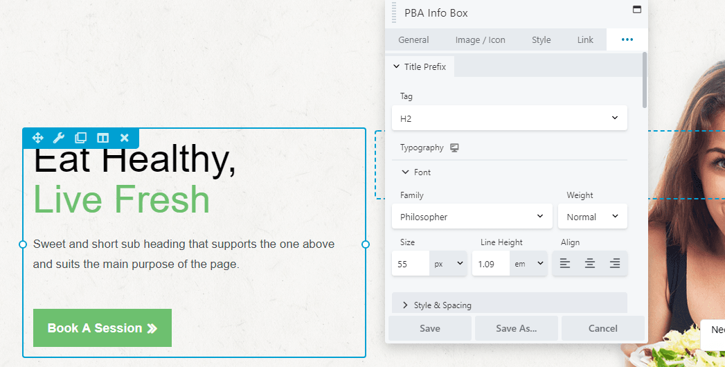
Step 4: Tweak Font Sizes Based on Device Type
In addition to the global settings that affect your entire site’s responsive behavior, there are plenty of ways you can adjust specific settings for responsive layout on a particular page or post.
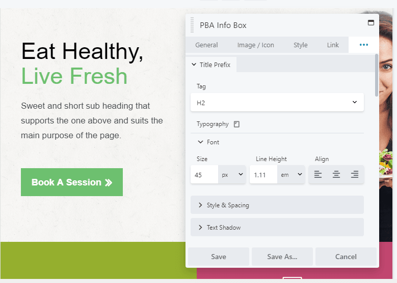
For example, you can specify different font sizes for each type of device. To see this in action, open an element for editing that includes text (click the spanner icon), click the top right three icons and select the typography tab:
In the Typography section expand the font category to change the default font size. Now click on the device icon next to Typography, and you’ll switch over to the medium-width (tablet) editor:
Now you can set a different size for the font that will only apply to medium screen sizes. Click on the icon again, and you can do the same in the small-width (mobile) editor:
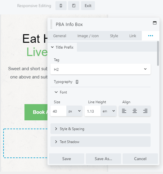
You can tweak the other font settings here as well, such as line height and alignment, and your changes appear only on the device type you indicate.
Besides using these responsive editing icons in your regular layouts, you can make all these changes in Responsive Design Mode as well, so you can directly see the changes.
Step 5: Tweak Column Stacking Behavior
The builder lets you create complex column layouts, and as screen width gets smaller, the builder moves horizontal columns to vertical columns in a predefined stacking order.
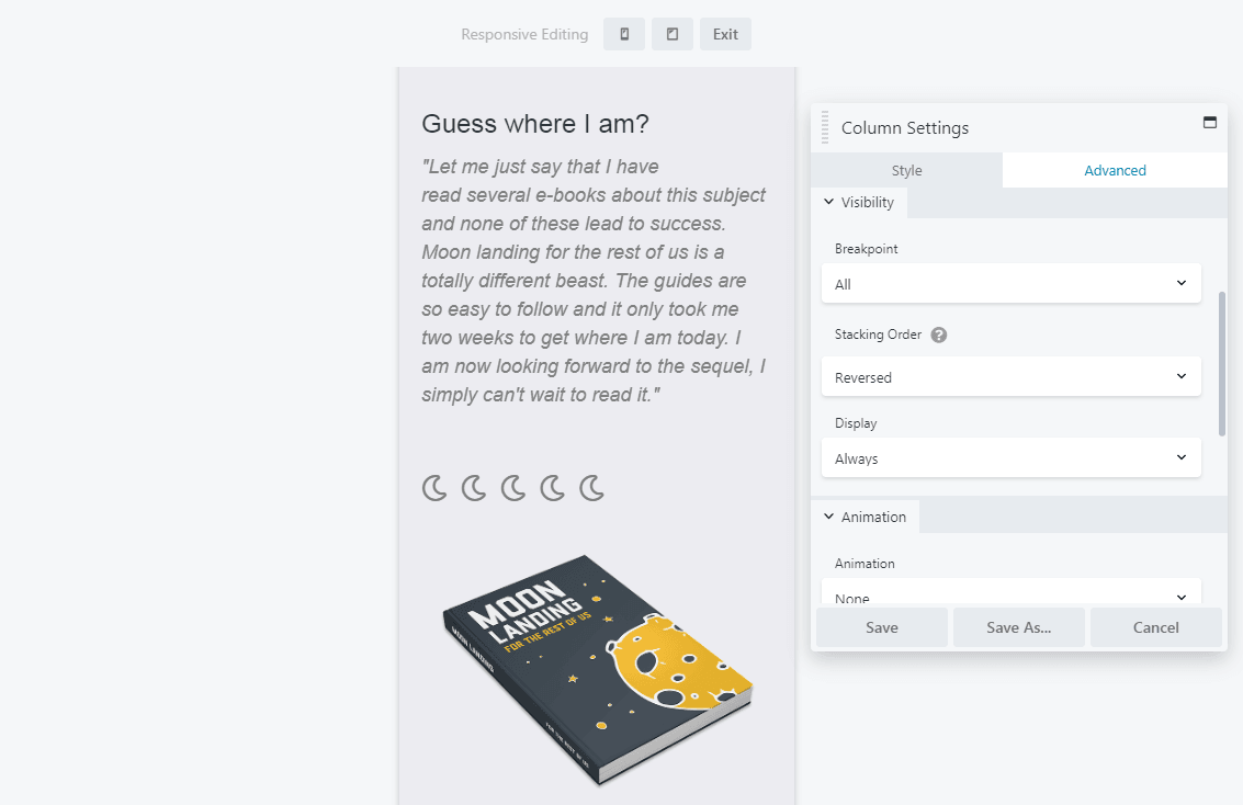
It’s a good idea to double-check and sometimes customize the stacking behavior of individual columns to ensure the content flow still works in a vertical orientation. Let’s look at an example of a page section featuring two columns:
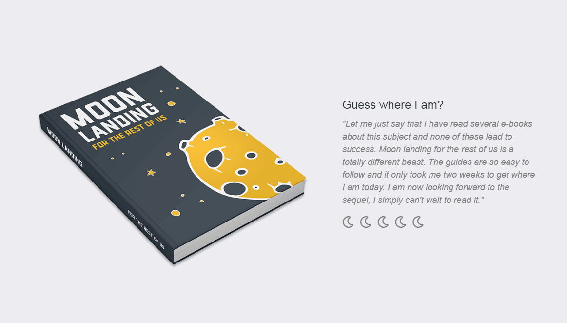
By default, on the mobile version of this page the image of the book shifts to position itself above the text on smaller screens: 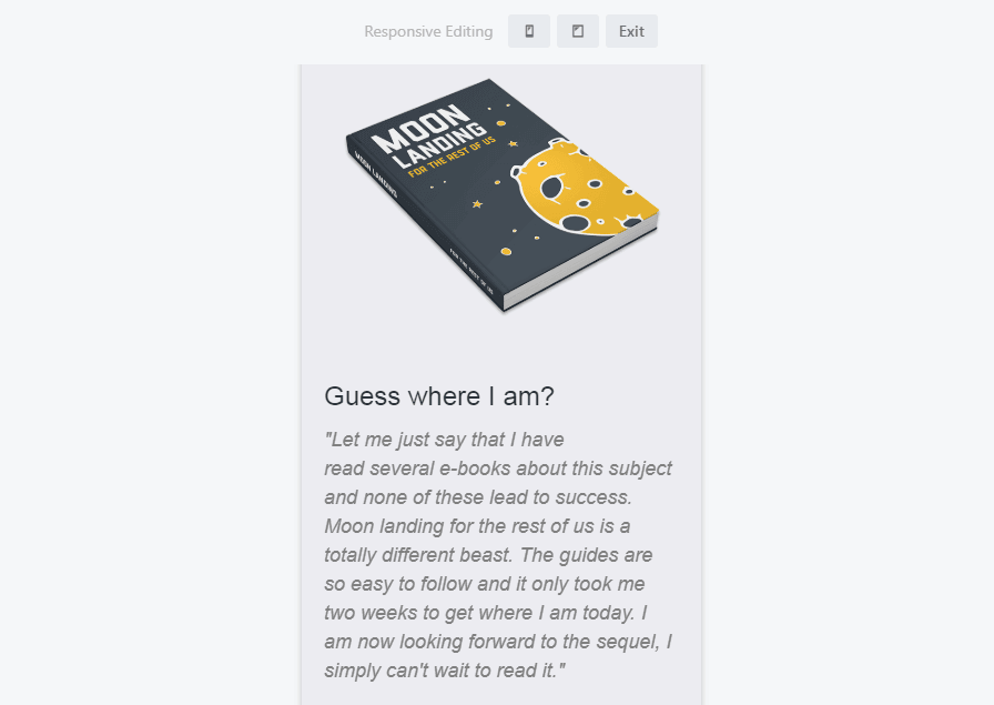
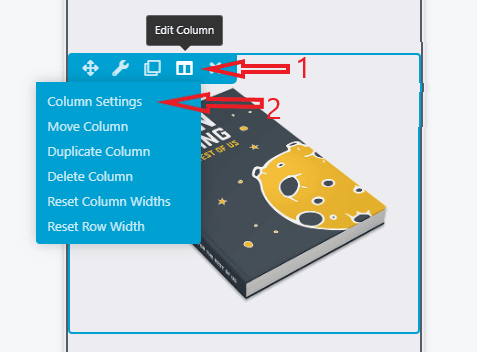
To change that stacking order, select one of the modules in the column and click Edit Column > Column Settings. Then click the Advanced tab and look for the Stacking Order option:
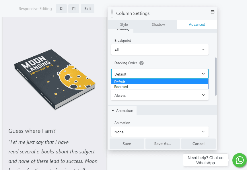
You can switch from Default to Reversed to change the way the column is ordered. In our example, the paragraph now appears above the image:
You can even prevent column stacking entirely by setting specific column widths for each device size on the Style tab, using either the responsive icon next to the setting or Responsive Design Mode, as described in previous steps.
Step 6: Hide Individual Elements on Specific Device Sizes
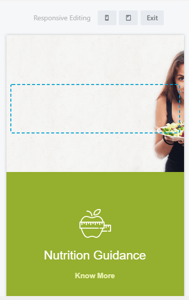
As carefully as you design each version of your page, some elements such as images add more to design than to content, and smaller layouts might work better if they’re hidden.
Here’s an example of how to hide specific elements on medium and/or small devices. Open any element for editing, click the top right three icons and select the Advanced tab, and look for the Visibility section:
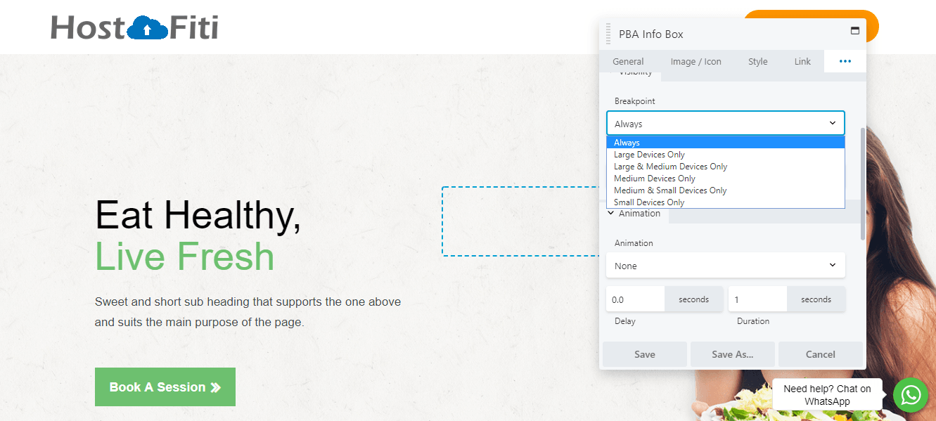
Expand the Breakpoint menu and choose the device sizes on which this element will be visible. If you choose Large & Medium Devices Only, the element is hidden on small devices:
You can also use this feature to create elements that will only appear on a specific device size, such as a custom call-to-action button that’s only visible on mobile devices.
Following these steps give you nearly total control over how your site looks and functions on screens of various sizes. All that’s left is to start designing! If you run into any difficulties while building your responsive site, you’ll find plenty of detailed instructions in the knowledgebase.
Conclusion
These days responsive websites are a requirement, not an option. Chances are that many visitors will view your site on a phone or other mobile device. If you want their experience to be just as good as a desktop browser, you have some work to do.
Do you have any questions about how to design your responsive website effectively? Ask away in the comments section below!
Do you think this article will help someone? Don’t forget to share.
Subscribe to be notified about new marketing, entrepreneurship & web development posts.
Make a Professional Website using HostFiti Website Builder
Having a professional business website helps you establish credibility as a business. Make your professional website using our drag and drop website builder in minutes and make it convenient for your customers to contact you.
Starting from